Africa Is Bigger Than You Think
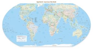 In the world map you grew up with, Africa is shrunk. For 450 years, the Mercator projection—the one that likely hung in your classroom—was designed to help sailors with direction but badly distorts size. On that map, Greenland looks about the same size as Africa, when in reality Africa is 14 times larger. And while Africa is actually 22% bigger than North America, the Mercator map makes it look smaller.
Now, the African Union has launched a campaign to replace the Mercator projection with maps that show true size over direction. NPR has an outstanding report on this effort: Correct the Map: Africa demands its true size.